SYS// BRSTD-2026
UPLINK // AUTH_OK
LAT 24.86°N
LNG 67.00°E
ATELIER // v3.04
SIG ▮▮▮▮▮
PWR 98.4%
TEMP 36.6°C
FREQ 2400.0 MHz
PING 012 ms
PKTS 000000
RNG 000.0m
VEC 0.000,0.000
ID 0x000000
brainiac/studio

Digital Studio

brainiac/studiobrainiac/studio

Ten Little Toes

Brand Identity · Doha, Qatar · 2023
— Client
Ten Little Toes
— Industry
Brand Identity
— Services
Brand Identity, Logo Design, Packaging Design, Pattern & Colour System
— Deliverables
Vector mark (SVG, PDF), Colour and type sheet, Post and story templates, Packaging artwork, print-ready
— Timeline
2023, with the store rebuild
— Team
Brand design, Karachi
— Year
2023
( 01 ) — the identity

What we designed for Ten Little Toes.

4 scenes · scroll
01.1

A burst of ten, in four colours.

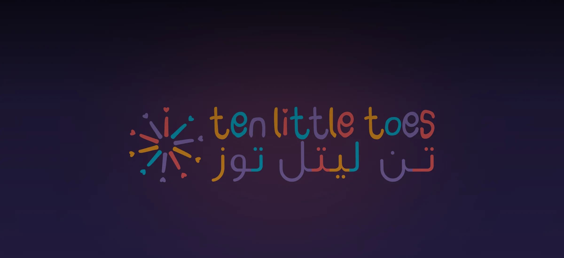
The mark: ten strokes radiating from a point, like fingers and toes, in coral, teal, orange and purple. The wordmark in English and Arabic beside it, in a rounded lower-case face.

  • On white — the store, print, packaging
  • On peach — the brush-stroke ground
  • On ink — kept for the website footer

Palette

  • Coral#F45D5C
  • Teal#04B4D3
  • Orange#FCA21E
  • Purple#8972BA

Type

ten little toes

Rounded, lower case · Friendly weight, bilingual wordmark, never shouted

The lines

  • 01ten little toes تن لتل توز
  • 02Healthy meals, happy smiles.
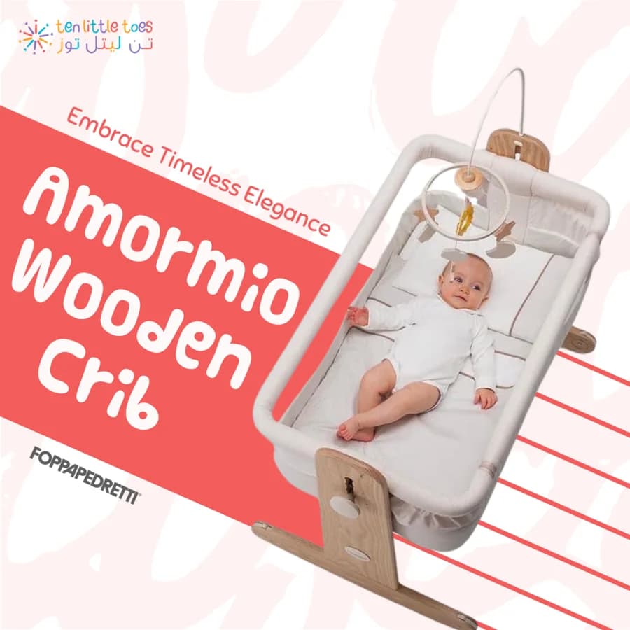
  • 03Embrace timeless elegance.
  • 04Perfect for mommies & kiddies.
01.2

The system, in four parts.

What the brand received, in the order it was built.

  1. Mark01

    The burst

    Ten strokes from one point. It reads at favicon size and on a shopfront, and the four colours survive a one-colour print.

  2. Colour02

    Four, plus peach

    Coral, teal, orange and purple carry the mark. A pale peach brush-stroke pattern is the ground everything else sits on.

  3. Type03

    Rounded lower case

    A soft display face for names and lines, a plain sans for the rest. The Arabic wordmark drawn to match the English weight.

  4. Pattern04

    Brush strokes

    The peach stroke pattern behind posts, stories, the holding page and packaging, so the brand is recognised before the mark is seen.

01.3

On packaging and posts.

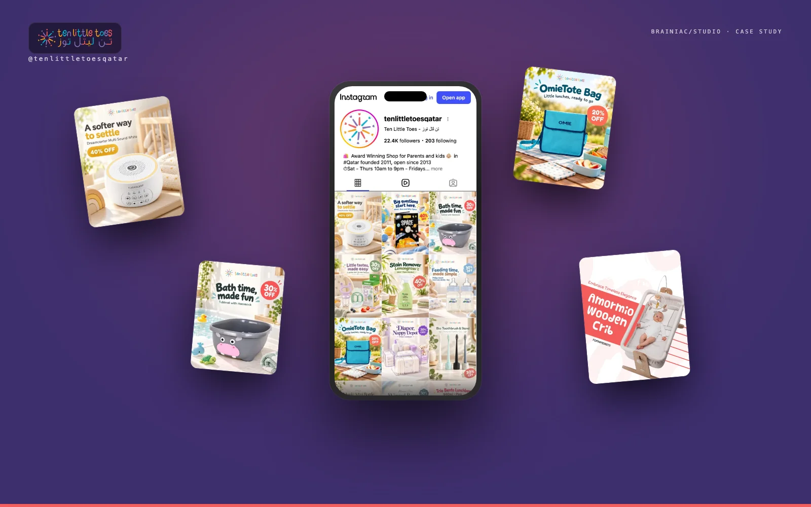
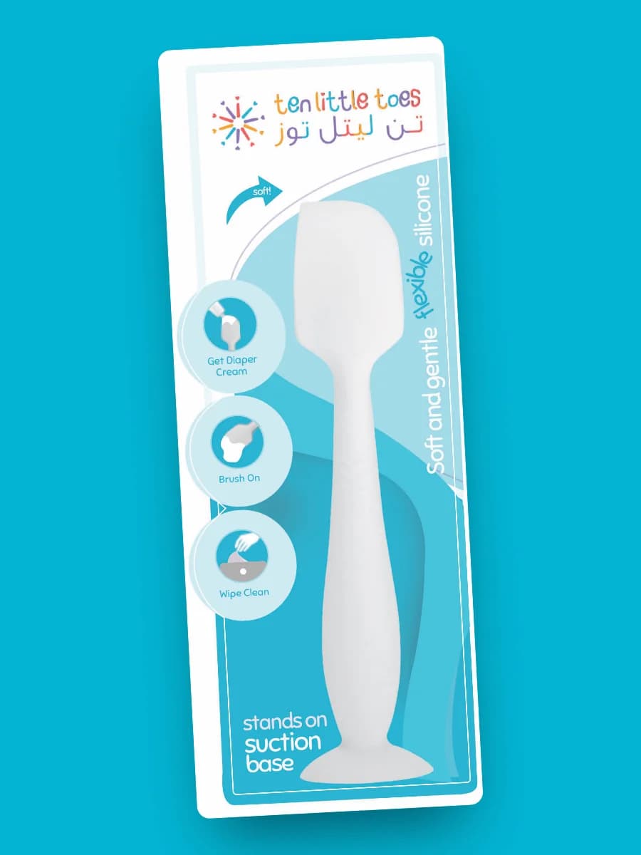
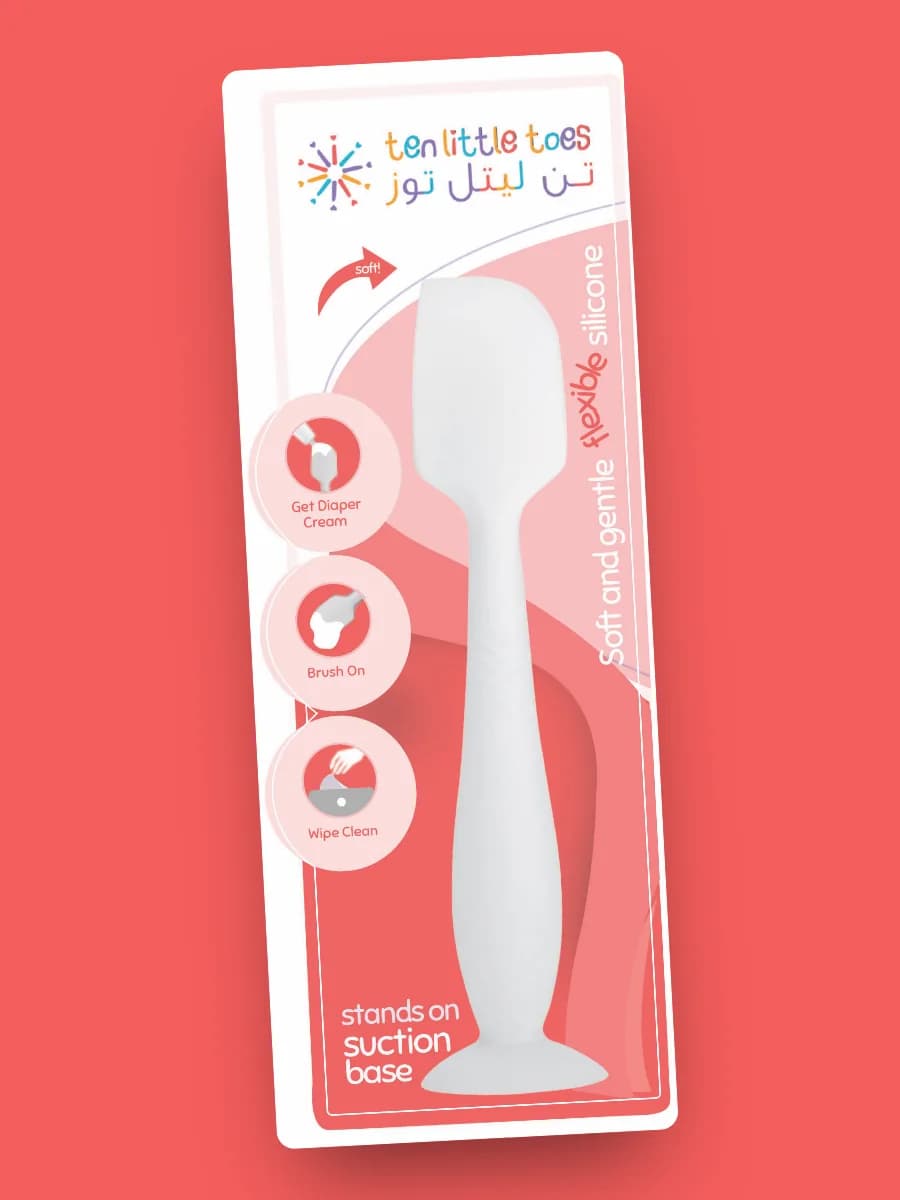
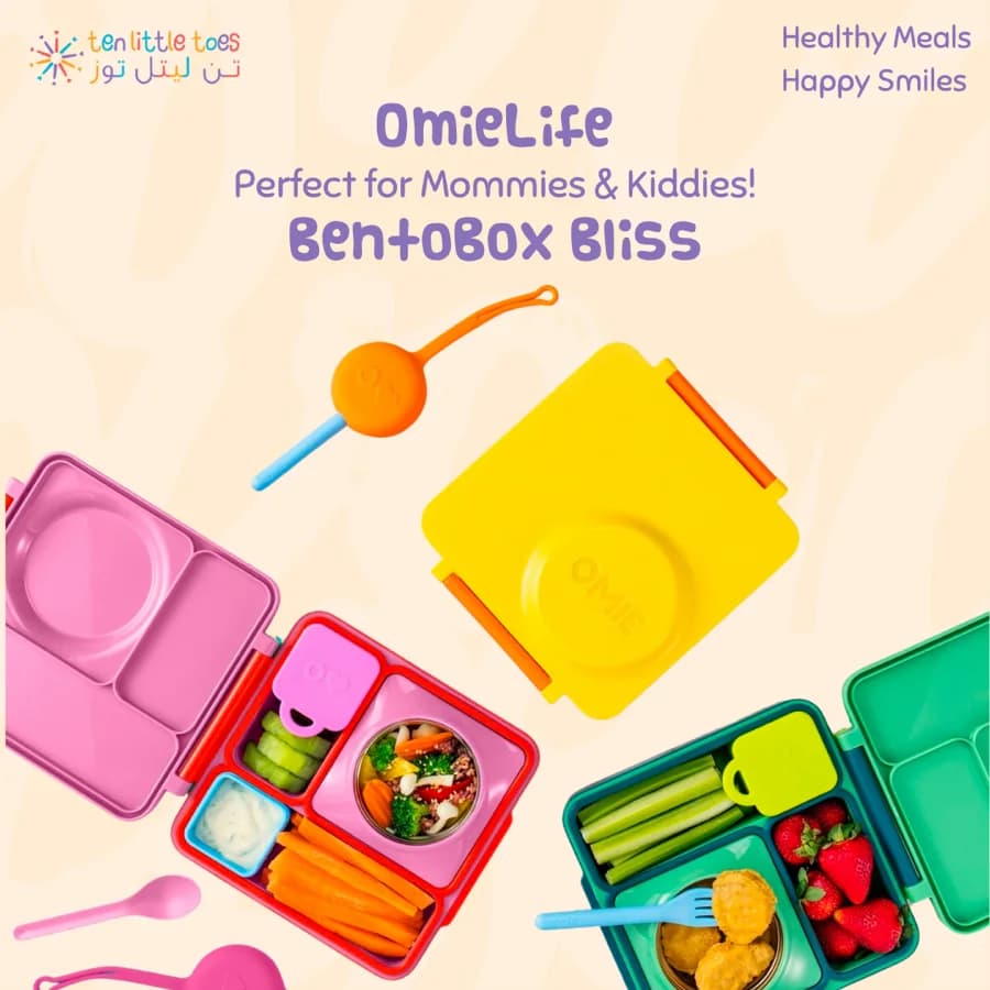
The identity on things you can hold: own-brand packaging for the silicone spatula in two colourways, and a product post on the brush-stroke ground.

Packaging

Own-brand

Packaging

The silicone diaper-cream spatula, blue colourway.

Card back, front face
Packaging

Own-brand

Packaging

The same card in the red colourway.

Four colourways in all
A post

Social

A post

OmieLife bento boxes on the peach ground, the mark top left.

Healthy meals, happy smiles
01.4

Where the mark lives.

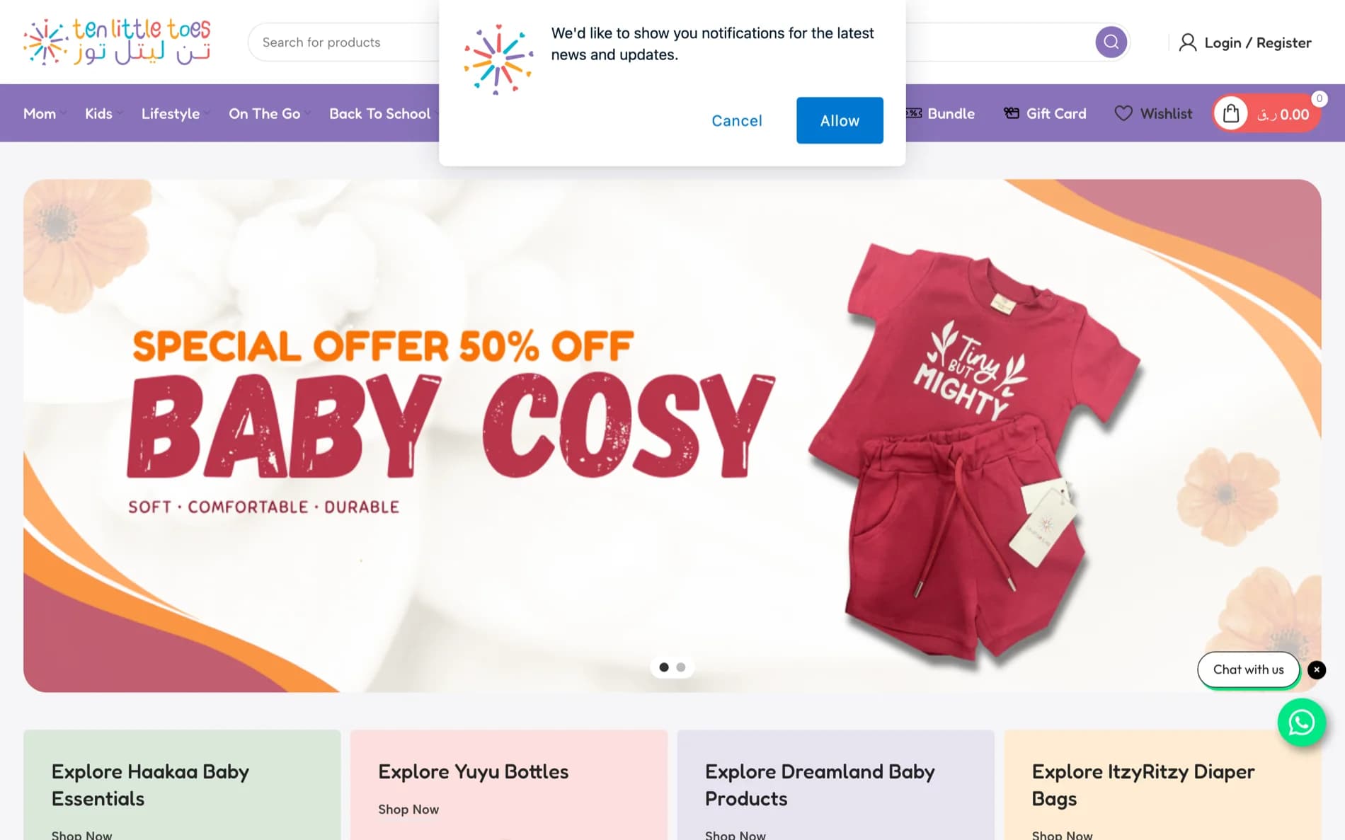
The tenlittletoes.co homepage with the mark in the header
01In the header of the store we built
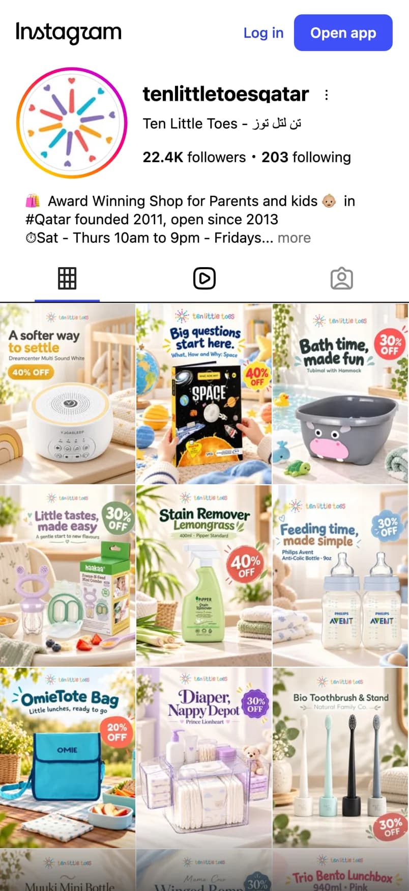
The mark as the Instagram avatar
02As the Instagram avatar, at 150 pixels
03The full lock-up: burst, English, Arabic
A product post with the mark top centre
04Top centre on a post, the brush strokes behind
The peach brush-stroke pattern
05The brush-stroke ground, as delivered: behind posts, stories, packaging and the holding page
— in short

The Ten Little Toes case study, in five lines.

  1. 01Brand identity, logo and packaging design for Ten Little Toes, Qatar's mama & baby store, by brainiac/studio.
  2. 02The mark: ten strokes from one point in coral, teal, orange and purple.
  3. 03A bilingual wordmark, English and Arabic at the same weight.
  4. 04A peach brush-stroke pattern as the ground for posts, stories, the holding page and packaging.
  5. 05Print-ready packaging for own-brand products in four colourways.
( 02 ) — the brief

What Ten Little Toes needed from a brand.

An established shop with a loyal following and a mark that had not been drawn for screens. The new identity had to keep what customers recognised and work at every size from a favicon to a window.

Qatar reads in two languages. The wordmark had to carry English and Arabic at the same weight, so neither looks like a translation of the other.

The brand was about to appear in many more places at once — a rebuilt store, daily posts, daily stories, ads and own-brand packaging — and all of them had to be produced from one system without a designer in the room each time.

( what we designed )
  • Brand Identity
  • Logo Design
  • Packaging Design
  • Pattern & Colour System
  • Vector mark (SVG, PDF)
  • Colour and type sheet
  • Post and story templates
  • Packaging artwork, print-ready
( 03 ) — the system

How the identity was built for Ten Little Toes.

  1. 01

    The burst

    Ten strokes from one point, like ten little toes, in coral, teal, orange and purple. It reads at favicon size and on a shopfront, and the four colours survive a one-colour print.

  2. 02

    The bilingual wordmark

    ten little toes in a rounded lower-case face, and تن لتل توز drawn to the same weight beside it. One lock-up, two scripts, never a translation.

  3. 03

    Colour and ground

    Four colours carry the mark; a pale peach brush-stroke pattern is the ground everything else sits on, so the brand is recognised before the mark is seen.

  4. 04

    Packaging

    Own-brand products such as the silicone diaper-cream spatula got print-ready card artwork in four colourways, with the lock-up, the pattern and the instructions in the brand's voice.

  5. 05

    Templates and handover

    Post and story templates, the colour and type sheet, and the mark in every size, so the feed the studio runs and the store it built draw from the same files.

( 04 ) — deliverables

What Ten Little Toes received.

1Lock-up: burst, English, Arabic
4Colours, each in the mark
4Packaging colourways, print-ready
2Template sets: posts and stories
( 05 ) — questions

What people ask about brand identity work.

Did brainiac/studio design the Ten Little Toes logo?
Yes. The burst, the English and Arabic wordmark, the palette and the brush-stroke pattern are the studio's work, delivered as vector files and templates. The store case study shows the mark in the site header; the social media case study shows it on every post and story.
How do you design a wordmark in two scripts?
By drawing the Arabic to the same weight and rhythm as the Latin rather than typesetting it in a matching font. The two sit side by side in one lock-up, and either can stand alone where space is short.
Does the identity include packaging?
For Ten Little Toes, yes: own-brand products such as the silicone diaper-cream spatula got print-ready card artwork in four colourways, using the lock-up, the pattern and the brand's voice for the instructions.
Can brainiac/studio design a brand for a retailer in Qatar?
Yes. Ten Little Toes is a Doha retailer we branded; Future Sports is a Doha academy we branded. Start with the design page or send us the brief over WhatsApp.
( 06 ) — formats

What was delivered, and in which files.

  • Vector mark (SVG, PDF)
  • Colour and type sheet
  • Post and story templates
  • Packaging artwork, print-ready
— ready

Working on something similar?

Tell us what you’re building. We’ll share the patterns we’d use.